11 Jun Information design: Making your audience instantly aware of your message

Information design: Making your audience instantly aware of your message
Written by: Carien Franken
Streams of information overload us 24/7. We humans have a ‘high speed information selection desk’, our brain, filtering this information. Our desk must decide what is worthwhile or not? Do I read this article or not, is this documentary interesting or not? Information design filters the stream of information, so that our ‘high speed information desk’ will not overload and overlook crucial information.
Large quantities of information slow down the ‘high speed information selection desk’. We know that it is easier to choose from a restaurant menu that only offers three dishes instead of fourteen dishes. The more options we have the longer it takes to react (also known as Hick’s law). It is crucial you select your information and your design elements wisely. Choosing the right design elements, allow you to layer your information, making it easier for those receiving the information to absorb and understand.
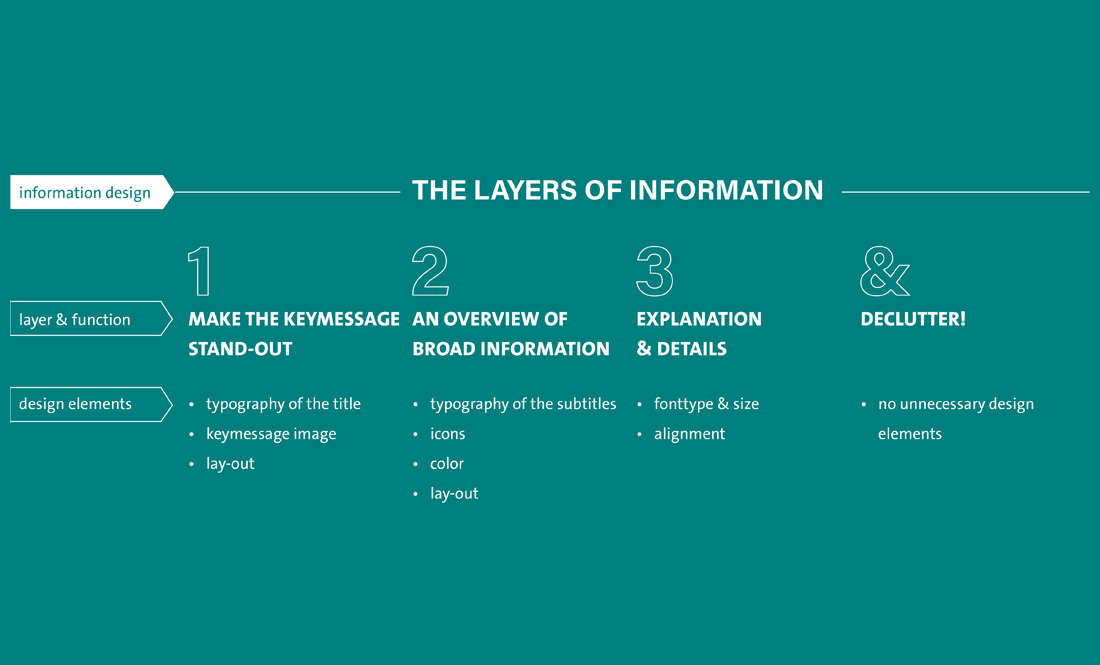
Here are some basic rules for clear and layered information design:
- The first layer tells the audience what your key message is. Make it stand out compared to the rest of the information.
Design elements options: Typography (font type & size) of your title, images of your key message (do I use a photo, illustration or a pictogram?) and lay-out (common rule: key information on top).
- The second layer gives the reader an overview of the broad information. This helps the reader understand what the information is about. Select this information wisely, limit yourself to the essentials.
Design elements to work with: subtitle typography, lay-out, icons (these simple images assist in giving an overview) and color.
- The third and final layer provides the necessary details and explanations.
Text will work most of the time and design elements are less important. They are already interested and ‘the high-speed information selection desk’ already decided that this is interesting. Still assist your audience by choosing your font wisely (font type, size, and alignment help the audience to read text smoothly).
Finish with reviewing your design; declutter unnecessary design elements. The more design elements used, the more distractions, the lower response time.
Every design element in your design has a reason. Ask yourself the question: Is there a reason why I use this image, color or font? If the answer is: ‘Because I like it or I don’t know’, it is time to declutter.
Conclusion: Reaching your audience means guiding your audience. Select your design elements wisely to make a layered design, ensure your key message stands out, give an overview of your information and declutter your design elements.
